
Tad by Benji Davies
Taking colour palette inspiration from works of art that you admire.
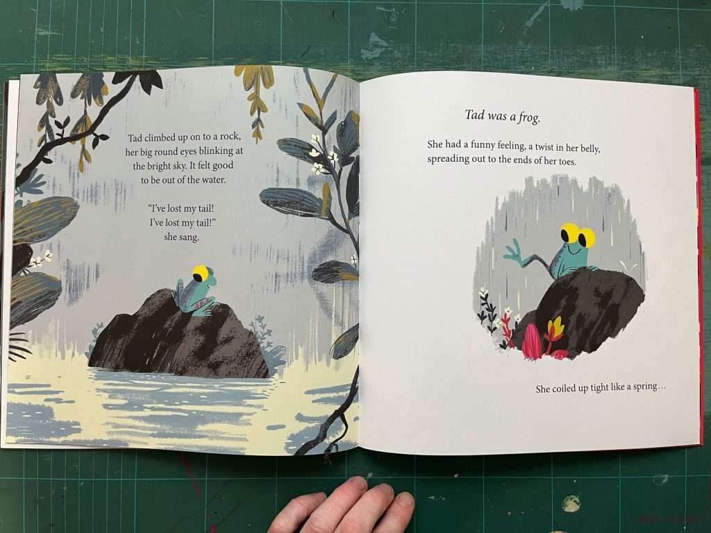
Tad by Benji Davies is definitely one of my top 10 favourites in my vast picture book collection. Yes, I have a picture book collection… I just love picture books! They are accessible works of art. I find them really inspiring, from the layouts to the character design to the colour palettes and the tactile paper used.
One of the first things that draws me to a picture book is the colour palette. I’ve started using my collection of picture books to explore new colour combinations/palettes. If you get stuck using the same colour combinations over and over again, it’s a really great exercise to freshen up. Take an image that inspires you and try and replicate that for new colour palette inspiration.
Before we get to the colour palette inspiration from ‘Tad’, let’s show some love for this beautiful picture book.

Published in 2019 by HarperCollins Children’s books. Text and illustrations by Benji Davies.
I will just say I love all of Benji Davies books! His style of illustration really sings to me. He has a tender softness to his work that make you wish you could jump into the scene. ‘Grandad’s Island’ made me cry it’s such a beautiful way of dealing with loosing a loved one. His very popular ‘The Storm Whale’ books are just stunning in both text and illustration. ‘On Sudden Hill’ was the first book of his that I bought. He has such a lovely way of painting the landscapes of the scenes, the characters are supper cute too!
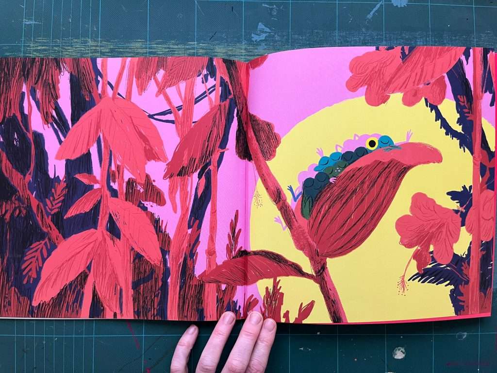
I would never have thought of putting yellow, pink and red together but it works so well. The book has some very dark pages so this pop of colour at the end just bursts out of the book.
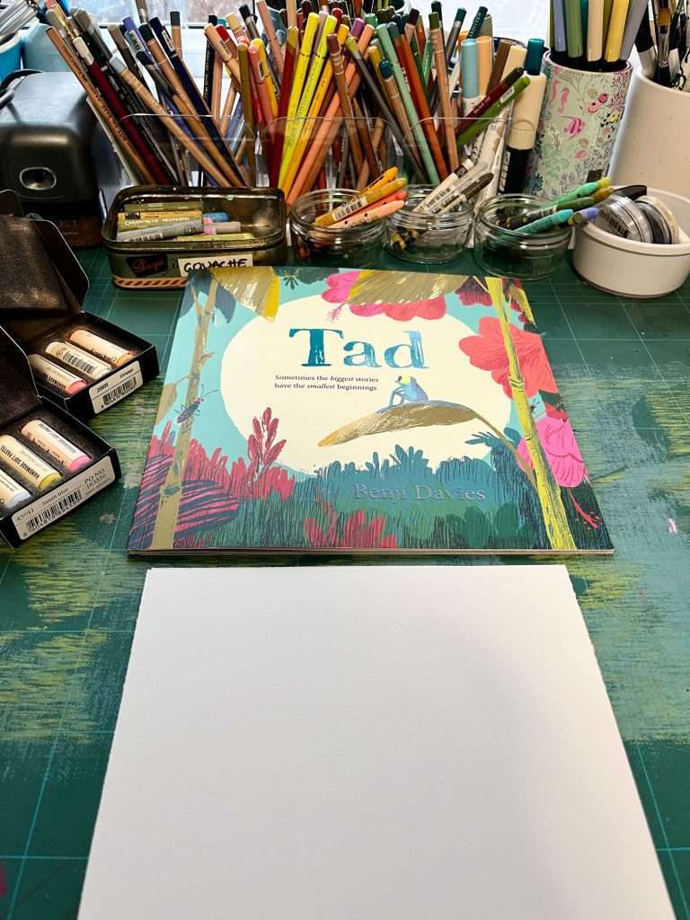
Creating a ‘Tad’ by Benji Davies inspired mixed media colour palette.
If you are short on time but want to have a quick colour play this is a great little exercise to do. Remember to log the colours in your Swatch Log – I have a post on this here.
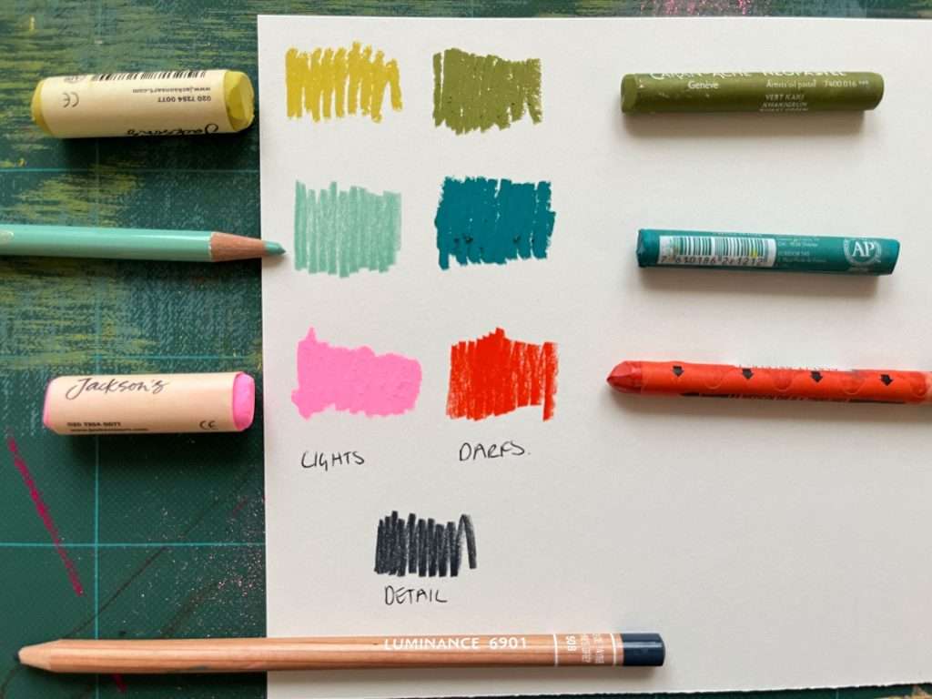
Analyse the colours first and simplify if needed. In this example, Benji is using a limited colour palette which is used throughout the book. I’ve broken it down to a pink and a red, a yellowish light green and a darker green and 2 greenish blues. I can also see a darker colour used for texture.
It’s important to note that everyone will see colour differently so this is very my my interpretation of Benji’s colour palette.
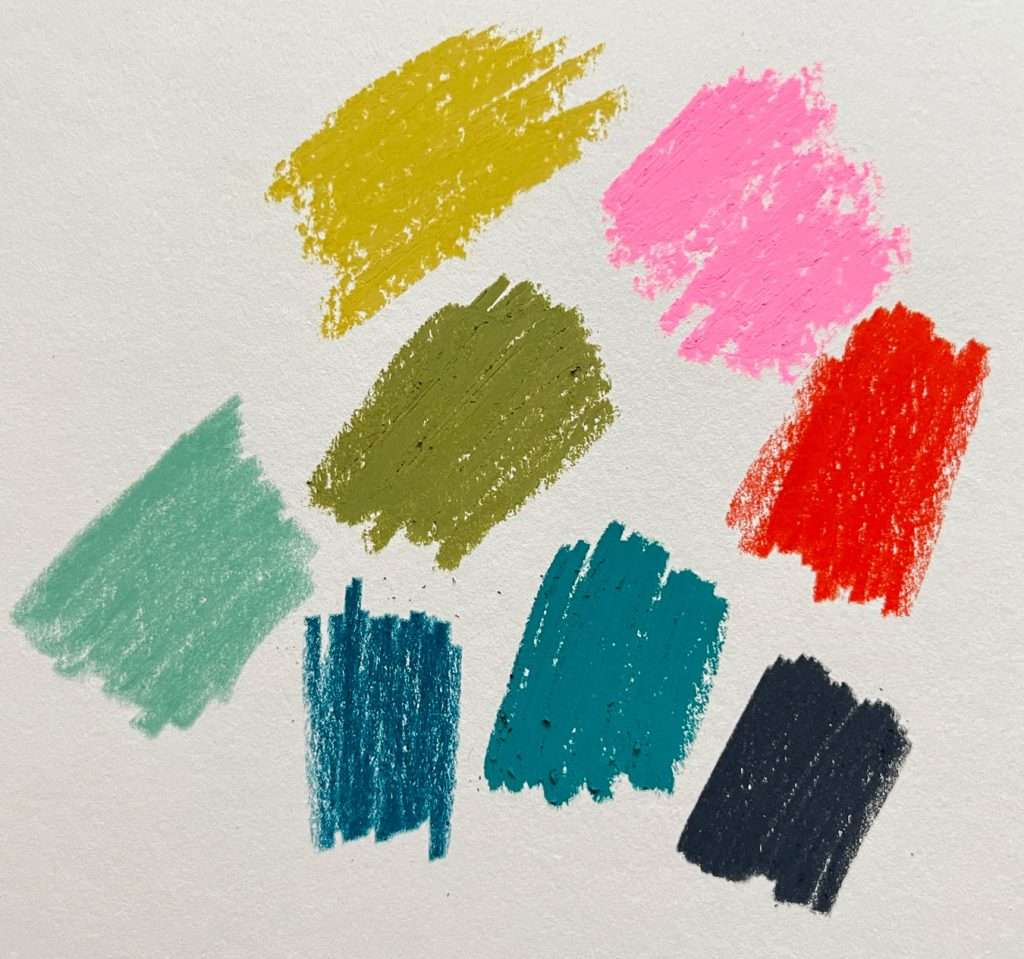

The combination of the red and pink I would never have chosen, which is why I love doing this exercise, you find new colour combinations to use.
The colours I used to create my ‘Tad by Benji Davies’ inspired colour palette are:
- Jackson’s handmade soft pastel* in 146 light green ochre
- Caran d’Ache Neopastel* in khaki green
- Holbein artist coloured pencil* in celadon
- Caran d’Ache Neopastel* in opaline green
- Jackson’s handmade soft pastel* in 703 fluorescent pink
- Caran d’Ache Neocolour 2* in vermilion
- Caran d’Ache Luminance* in 508 paynes grey
As someone who is alway drawn to greens and blues, I absolutely LOVE this colour palette. It will definitely be going in my Swatch Log!
Thanks for reading, let me know if you give this colour palette inspiration exercise a go xx