
Can you accurately mix paints using CMYK colour codes?
As a graphic designer I spend a lot of time working with CMYK colours. Whilst I was dreaming up things to do on my ‘Sunday afternoon creative play sessions’ I started to wonder if you can accurately mix paint using CMYK colour codes? Once this question was in my head, it’s been all I can think about all week! So here goes…

Want to go straight to the summary?

What does CMYK stand for?
CMYK stands for the inks used in printing: C=Cyan, M=Magenta, Y=Yellow, K=Black.
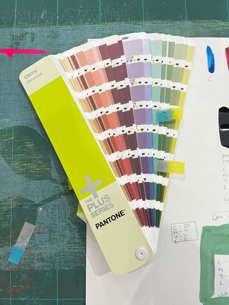
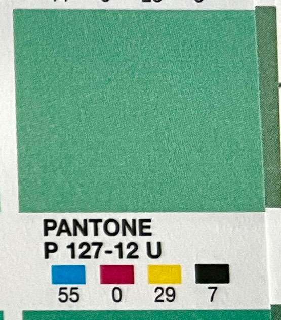
When working in the CMYK colour space (when designing for print) each colour has a code which is like a recipe to tell the printer what percentage of each colour is needed to create the desired colour.

For example a nice mellow greeny blue would be C-59, M-0, Y-29, K-11. If you are interested in how 4 colour printing (CMYK) works, then I would recommend heading over to https://www.formaxprinting.com/blog/2018/09/printing-lingo-what-is-4-color-process-printing to read more.
I’m using a CMYK uncoated swatch book from Pantone.
Why are you trying to mix paint colours using CMYK colour codes?
Good question! I guess I’m enjoying going back to basics with my art practice and giving myself permission to play and experiment with materials. I’m also much more familiar with CMYK colours than I am of artists paint colours such as ‘cadmium orange’ or ‘payne’s grey’.
My yearning to create beautiful landscape paintings with stunning colours is strong but my skill level is not there yet so my Sunday afternoon creative play sessions are all about the process rather than the result.
Plus I quite like methodical experiments that make me feel like a scientist!
What paints did you use?
I selected acrylic inks as they come with the handy dropper tool so measuring accurate amounts of paint should be relatively easy.
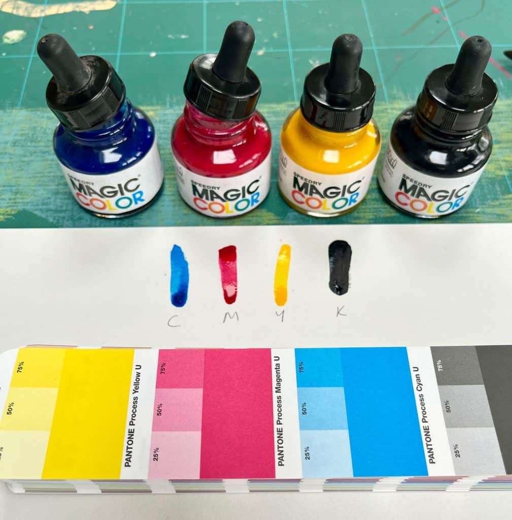
I opted for Speed Dry Magic Color acrylic inks from Jacksons* as they have the process colours (Cyan, Magenta and Yellow) and are a reasonable price.
How did you convert the CMYK colour code to paint measurements?
This is where it got a little ‘mock scientific’ (not really I just like to pretend!).
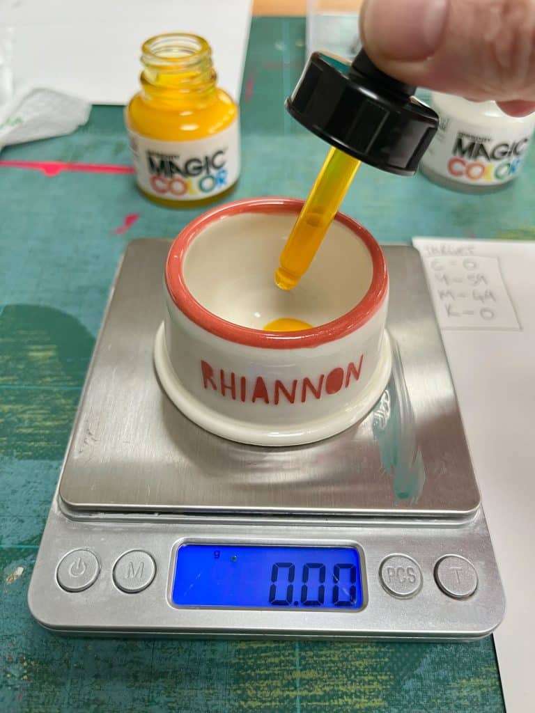
To make the maths as easy as possible I used the CMYK numbers as milligrams (I think this is the correct term!)
So my first recipe was:
- C – 59 = 0.59g
- M – O = 0.00g
- Y – 29 = 0.29g
- K – 7 = 0.0.7g
To measure the very small amount of paint (to limit waste) I used my small measurement digital scale which I have for measuring my pottery glazes, this one is the Amir digital scale 500g – 0.01g.
So what happened, did you manage to mix CMYK colours in acrylic inks?
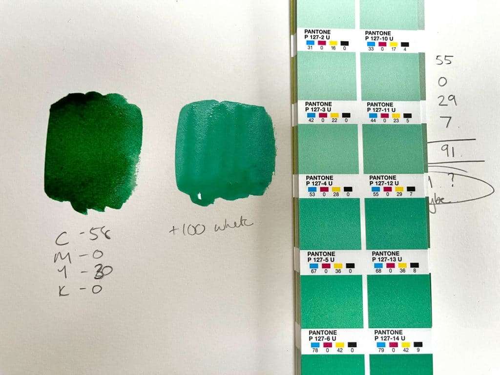
Well yes and no! First off, the result was just black as you can see in this picture. So I had to make a few tweaks and then YES it actually worked!
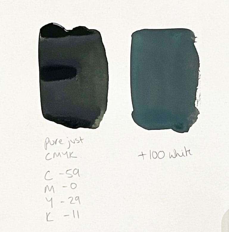
It was very clear from the first swatch that the black was way too overpowering so I either completely excluded black or just added a drop – even a drop was too much as you can see from the yellow.
It was also clear that there needed to be a neutral mixer so I included 100% (or 1g) white to each recipe/mix.
Is there an easier way to convert the CMYK colour code to paint mixes?
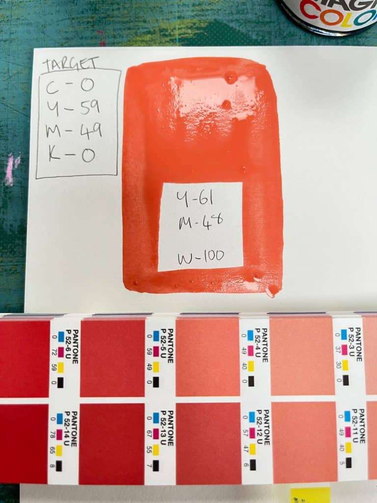
Yes! I started to wonder if I could replace the weight measurement with just drops from the pipettes.
So using the formula 1 drop = 10 (10% or 0.10g) I had a go at mixing the same colours again.
It works! So now there is a super simple way of taking a CMYK colour code and converting it into a recipe for paint mixes
So taking that first recipe again:
- C – 59 = 0.59g OR 6 drops
- M – O = 0.00g
- Y – 29 = 0.29g OR 3 drops
- K – 59 = 0.11g OR a spec (because it turns out the black is too strong!)
- + W – 100 = 1.00g OR 10 drops (white base)
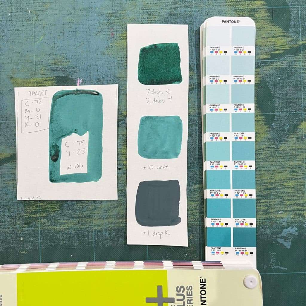
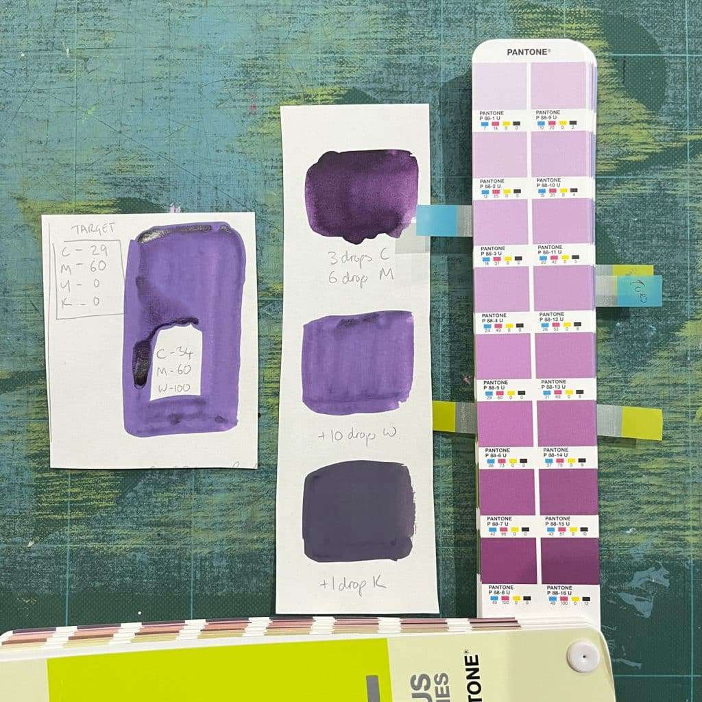
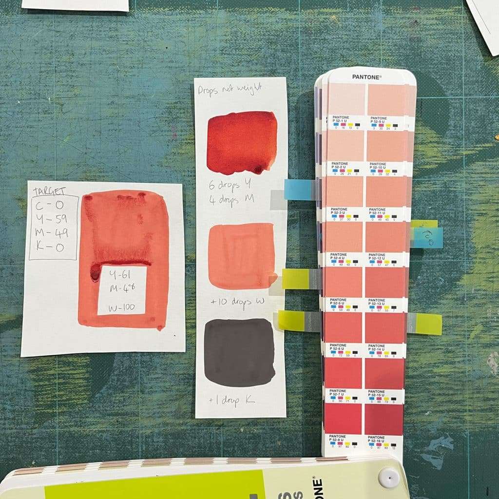
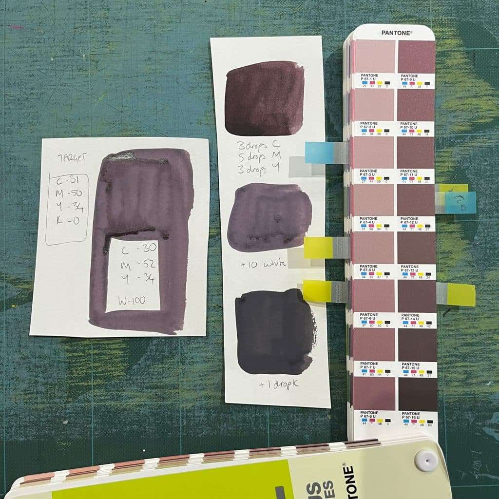
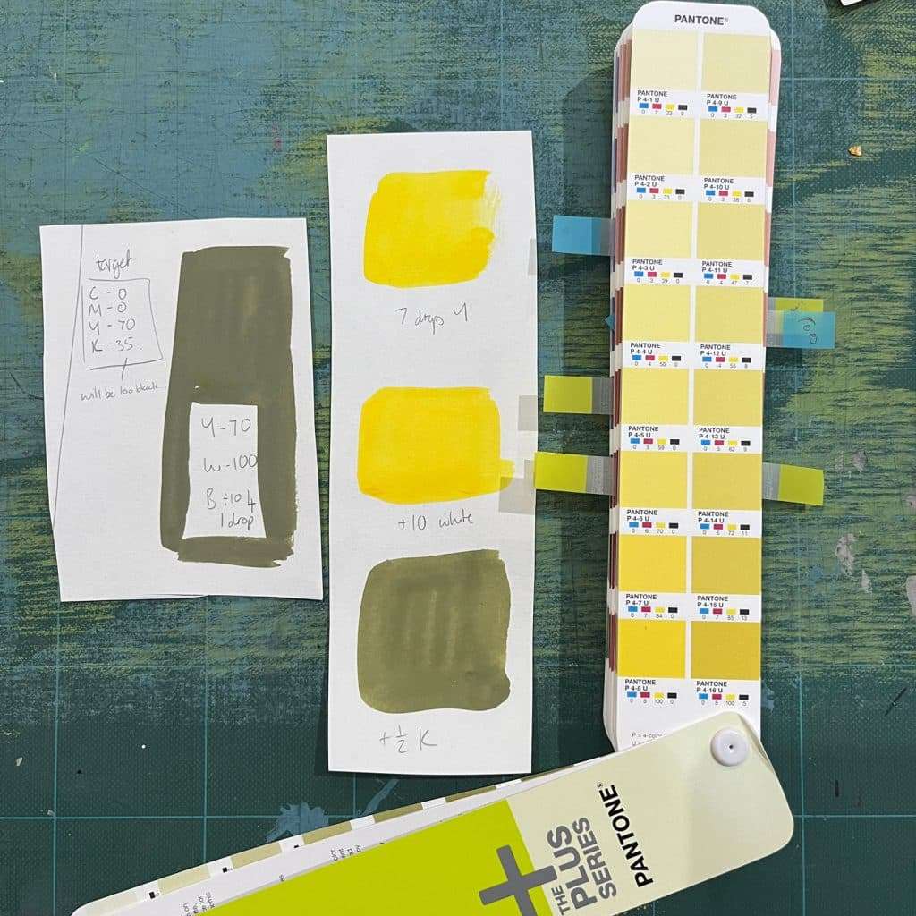
As you can see, even the addition of just 1 drop black it’s still too strong and results in much darker and muddier colours than intended.
How can you use this in your art practise?
What got me really excited about this was the realisation that this would be the perfect method to use when mixing your own acrylic paint markers. I will be doing a post on this soon as it’s so much fun.
Talking of acrylic markers, I recommend becoming a patron of TJ Marston or following her on instagram at Sketchitstudio as she has a wonderful patreon video about mixing your own markers – her artwork where she uses the markers is also totally beautiful (big TJ fan here!).
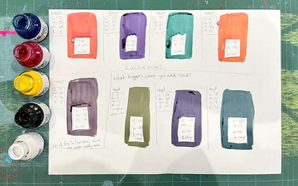
You could also use this method of more mathematical colour mixing if you wanted to limit the number of paints you needed to purchase and then premix your own palette.
By creating a more mathematical approach to colour mixing you are creating a swatch book or palette that you can accurately recreate over and over again.
Can you scale the recipes?
This is the other exciting thing, it’s totally scalable! I used milligrams and drops as I didn’t want to waste paint, but if you think in terms of percentage then you could scale up as much as you like.
- C – 59/100 = 59%
- M – O/100 = 0%
- Y – 29/100 = 29%
- (K – remember to ignore the black number and a tiny specs at a time until you reach the desired colour)
- W (white base) 100%
So can you accurately mix paints using CMYK colour codes?
To summarise: you absolutely can use the CMYK codes to create relatively close versions of the hue if you…
- Ignore the black amount – add teeny specs at a time if possible
- Use a white base of 100%
My only caveat to this (that I wasn’t expecting and has turned my design for print world upside down) is that when I created the same colour on my digital devices (I tried photoshop and Procreate) the colour came out completely differently even to the swatch in the Pantone book! I need to look into why this was as it really should have looked the same as the pantone book!
This does mean that you’d have to be careful if you intend (like I did) to create a digital palette first to test the colours together before mixing your paints. So for now I will be using the swatch books as reference.
Will this replace traditional colour mixing?
Umm, I’m not sure! It was definitely a very interesting activity and I feel I have learnt more about colour mixing. I think it definitely has a place where you want to be able to re-create the same colour mix over and over again (for example if you were mixing your own paint markers).
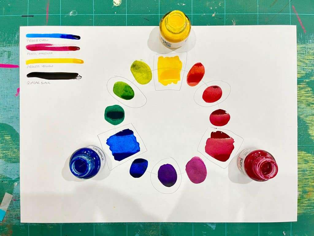
However when you analyse the percentages of colours used it’s not really that dissimilar to the traditional colour wheel method. My first example of the mellow greeny blue ( C-59, M-0, Y-29, K-11) is basically a mix of yellow and blue that has double the amount of blue than it does yellow; well this is just the same as a tertiary colour which is made up of blue + blue + yellow.
From that end it’s also a good reference guide to show you what primary colours you need to make up other colours and I dare say I will be using my CMYK knowledge now to help me mix colours when I’m paining.
Want to give it a go?
If you are anything like me then my mind was totally buzzing after doing this colour mixing experiment. If you need a little methodical creative play session then I thoroughly recommend trying this.