How to mix acrylic colours for landscapes
I love going on art courses, do you? I’ve recently been on Melanie Morris’ Fearless Landscapes course found here. It was fab and I learnt loads. I still haven’t got to where I would like with my painting skills but I’m getting a lot better and understanding it’s a journey and I am very much enjoying the process.
Melanies colour palettes in her paintings are what inspired me to take her course, and it did not disappoint. There were many lessons about colour and I came away with a greater understanding of using a relatively limited palette to full effect.

Which colours do you need for landscape painting in acrylic?
Obviously this is totally up to you but I’m going to talk through what I learnt on the Fearless Landscape course. Melanie recommends Golden heavy body acrylics* in the following colours:

Can I use any brand or type of paint?
Yes absolutely! As with all the unplugged colour experiments the freedom to explore, investigate and discover without bounds is the ultimate goal. Do if gouache is your thing go for it. The principles will be the same, the results maybe different.
I’m using Golden acrylics here as this is what Melanie recommends and I received a started set at Christmas. Melanie does say that colour mixing with student grade paints will result in different outcomes (different is not necessarily bad so if you have student grade acrylics please don’t go out and buy the more expensive artist grade paints). I also have Daler Rowney graduate acrylics and Sennelier abstract acrylics in my collection which have a much lower price point than the golden acrylics so I may try this exercise in those to see if or what the difference is.

The first exercise is to look at the basics, how to make your colours lighter, darker, duller, warmer and cooler.

To warm the colours, we used an addition of the warm colours – yellow, orange and red. Don’t add too much as we don’t want to alter the hue, but enough to adapt the temperature of the colour.

Then you can use the cooler colours on the colour wheel – blue, alizarian crimson, diox purple to create cooler versions of the starter colour.

Then a simple act of lightening the starter colour with titanium white.

To create darker colours, it’s best to avoid adding black (as this creates very dull and too dark mixes). More of the cool colours are used here.

Next is creating duller versions of the starter colour. Using the colour wheel (see my colour wheel basics post here) you need to add a touch of the complimentary colour which is the opposite colour on the colour wheel.

Greens, greens and more greens!
Obviously a key ingredient in landscape paintings is green. Yes you could you one of the many greens available to you straight out of the tube, but where’s the fun in that? also by mixing your own you are creating your own unique palette for your work.

In the next exercise we created 4 starter mixes of greens using Hanza yellow + ultramarine. Hanza yellow + cerulean blue. Hanza yellow + phthalo blue. Cadmium orange and phthalo blue. These looked like this:

The follow the same pattern of tinting the shade with other colours from the palette to create lighter, warmer, cooler and duller hues of green.


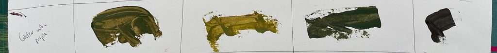

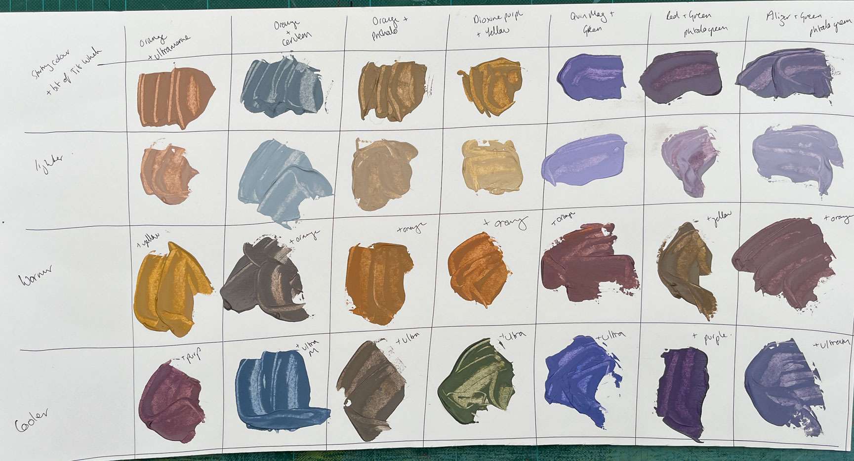
Mixing neutrals
This was the bit I was most excited about with mixing colours for landscapes in acrylics as Melanie’s palettes have the most georgous muted neutral tones in them. I’m going to do this exercise again as the resulting palette should have been more neutral and grey and many of mine are on the purply side of things – though I really like the resulting colours.
Neutral colours such as greys and browns are created by mixing opposites on the colour wheel or complimentary colours.

The starter mixes are:
- orange
- ultramarine
- bit of titanium white
- orange
- cerulean
- bit of titanium white
- orange
- phthalo blue
- bit of titanium white
- diox purple
- hanza yellow
- bit of titanium white
- quin magenta
- green
- bit of titanium white
- red
- phthalo green (blue shade) – I had this in my collection so decided to add it!
- bit of titanium white
- alizarian crimson
- phthalo green (blue shade)
- bit of titanium white


Wow! I count 77 colour mixes from the palette of just 10 acrylic tube colours.
I’m sure there are many more colours that could be created too from this palette. I’m in love with the neutral muted colours and will definitely explore these further.
I hope you enjoyed learning about mixing colours in acrylics for landscapes (and beyond!). Thanks for reading x