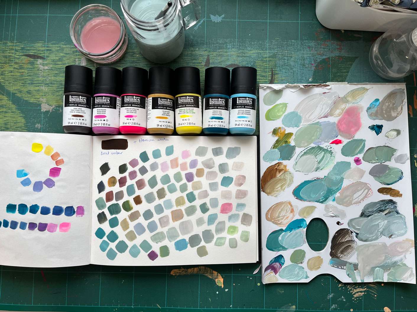
Mixing neutrals from bright colours using burnt umber and titanium white.
If you read my post about choosing your own personal colour palette here you will know that my palette is quite a bright one, involving lemon yellow and fluorescent pink. So now I’m going to look what further colours I can create from my base palette, in particular the neutrals and more muted tones.

In my arty explorations, one of my intentions is to really get to know my colours well, so that using them to create whatever imagery I choose becomes easier and less frustrating!
I read somewhere that burnt umber is a great colour to have as a neutralising colour, so I will be using this and titanium white for todays session. You can also use complimentary colours (the opposite colour on the colour wheel) to neutralise colours but I’m aiming to develop/learn a quick and easy system.
I will be using my new favourite paints which are the Liquitex Acrylic Gouache*. They are a lovely mix of fluidity and opacity.

I started with a quick basic colour mixing trial as I have added Medium Magenta to my palette and I wanted to see how this would mix with the other colours.

Adding burnt umber to neutralise bright colours
I have quite a haphazard or free approach to my colour experiments! so after I mixed a few secondary colours on my palette I then used these to see what effect the burnt umber had on them. So scientific measurements here, just adding various quantities to see what happens. I find this is the best way of learning… just jump in and see what happens!

I can’t remember where I read about burnt under being a useful colour, but I’m very glad I did. I really like the colours it created, especially the greens. The greens from my palette are quite bright and vivid but with the addition of a bit of burnt umber it has really added depth to the colour.
I then got carried away with mixing the various blobs of colour on my palette with titanium white and burnt umber. My palette ended up looking like this! You can tell I have a strong leaning towards greens.

Final colour mixes
As I get lost in this type of process, I don’t tend to write down what colours are in what mix. This is part of the beauty of starting with a limited palette, it’s easier to recreate mixes as there is limited choice of initial colours.

I love that this colour play session shows that you can take bright colours and create some really beautiful muted colours. As well as showing that with just 6 base colour plus white and burnt umber you can create infinite colours.
I will definitely be adding burnt umber to my basic palette, it worked really well to mute the colours without muddying or turning them to brown (which is what I thought might happen). You don’t need much of it to just take the edge off the brighter colours.
Thanks for reading x