
25 Watercolour colour mixes and what to do first with your new palette.

A great way to get to know your paints is to freely play with the colours in your palette and experiment with creating different mixes. If you haven’t got your paints yet and aren’t sure what to get, no fear I’ve done 25+ colour mixes to give you an idea of what colours can make what.

Let’s dive straight in to colour mixing with watercolours.

When I start my colour mixing tests, I always begin with a quick primary (yellow, red, blue) to secondary (green, purple, orange) colour mix.
The colours used here are:
- French ultramarine
- Cadmium red
- Lemon yellow
- Cobalt blue
- Alizarin crimson
- Cadmium yellow

I then focus on one colour in my watercolour colour mixing tests. Here it’s lemon yellow. I’m adding other yellowish colours to create more unique and muted yellow hues.
Adding yellow ochre and raw sienna in particular have made much warmer yellows (Lemon yellow is on the cool side). the burnt Sienna mix has turned the lemon yellow into a lovely warm red/earth mix.

Further mixes of lemon yellow. I love how the cool lemon is gently warmed up by the addition of these colours.

Still using lemon yellow, I then move on to alternative secondary watercolour colour mixes – using blues to make greens.
Here lemon yellow is mixed with: cerulean, turquoise, French ultramarine and cobalt.
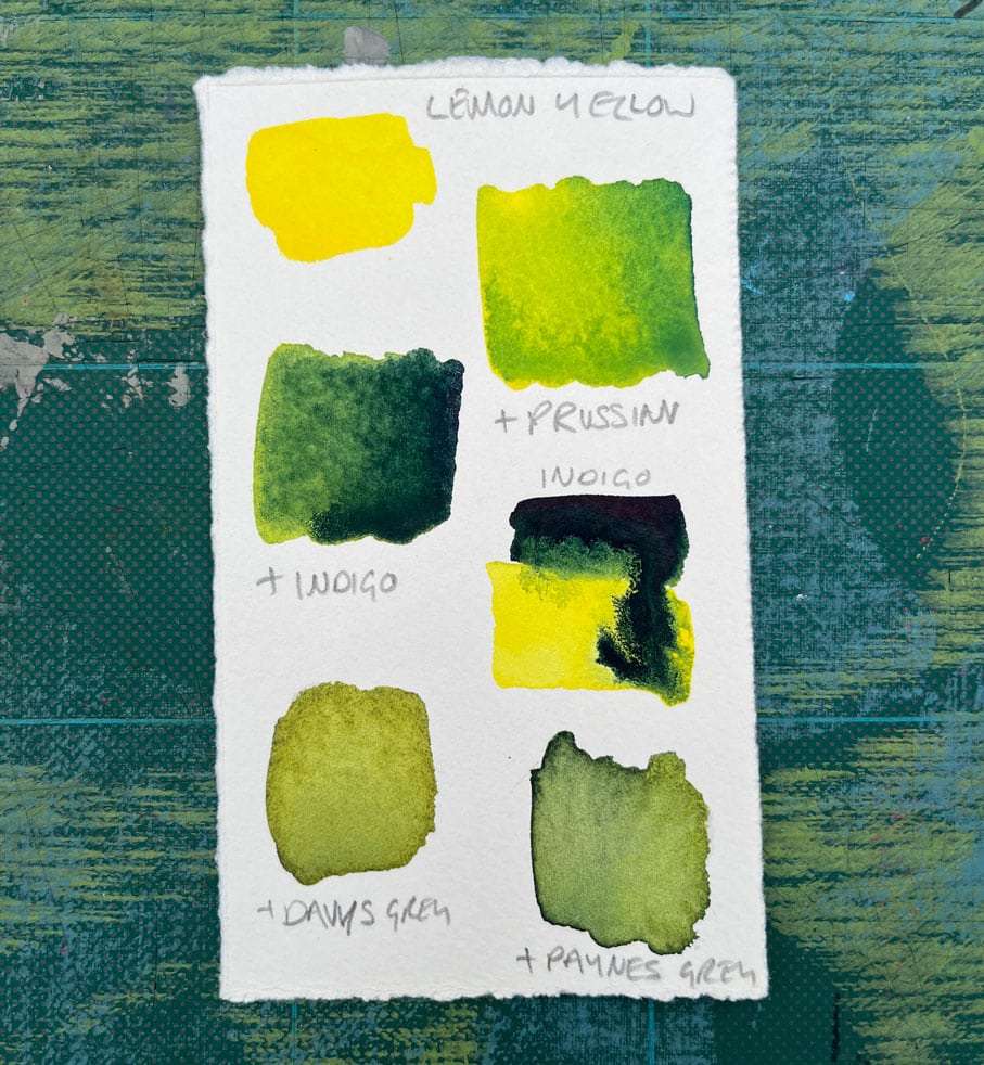
Some lovely granulation happening here. I’m loving the earthy olive green created by the lemon yellow and davy’s grey mix.
Colours used here are: Prussian blue, indigo, davy’s grey and paynes grey.

Here I’m using French ultramarine and alizarin crimson (primary colours) to create purple (secondary colour).
The different saturation of the purple mix shown above is typical of how you can use more or less water in your mixes with watercolours.

Turquoise mixes with cadmium red, light red and rose madder. I am totally in love with the turquoise:rose madder mix!

The greens. The top four colours, emerald, olive, sap and viridian are straight out of the pan colours. I always think it’s nice to slightly adapt pan colours to create your own unique colours.

This is a secondary mixed green made up of lemon yellow and French ultra marine blue with burnt Sienna. The burnt Sienna tones down the vividness of the green.

From left to right, top to bottom: Prussian blue and raw Sienna. Prussian blue and indian yellow. French ultramarine and raw Sienna. Cobalt blue and Indian yellow.
The colour mixing possibilities are endless!
What can you learn from doing this colour mixing with watercolour experiments?
Firstly, it’s a great way to get to know your colours and what you can lake using the colours in your palette.
Secondly, you may just discover a new favourite colour combination. For me, after doing this exercise, I have a new love of using raw Sienna to create beautiful muted colours.
Bonus look at my watercolour palette.
I have in the past bought pre-filled palettes but find I never use all the colours or feel like I’m missing a few of my favourites. So after I graduated from my MA in design I treated myself to creating my own palette.
I purchased an empty tin palette* and treated myself to artist grade watercolours from both Daler Rowney* and Winsor and Newton*. I always make a mini swatch to include in my tin as a reference.


I hope you enjoyed this colour mixing with watercolours post.
Colour mixing in a free way like this is truly one of my favourite past times! Thanks for reading. xx
